PlanTerra
>Fall 2022>INF385C: Human-Computer Interaction
>Role: UX Design, Research
>Team: Stephanie Cyrill, Aayush Jain, Krishna Somepalli
>Tools: Figma, FigJam, Usertesting.com, Qualtrics, Google Slides
PlanTerra is a mobile app to help you and your plants grow.
Context
Pets are the new kids, and plants are the new pets! However, this means that figuring out when and how to care for them has become increasingly important for both new and experienced plant owners. Many people are trying to take better care of their plants, but they may not know where to start.
Solution
The PlanTerra app is designed for plant enthusiasts who want to know more about plants and people who might want to take better care of their plants but are unable to find out how. Providing a platform for tracking plant maintenance will encourage users to be more involved in the process of raising their plant and ensuring its thriving. Additionally, such a platform will make its users more confident plant parents as they are able to diagnose and ensure their plant is receiving the best care.
Full project documentation can be found here.

Main Goals + User Research
The PlanTerra app intends to help users complete multiple types of goals regarding plant care and maintenance. The onboarding process would have users self-identify their level of experience with plants, which will help tailor the amount of information shown to them regarding best plant care practices.
The features of the PlanTerra app will include: a virtual garden that represents their real-life plants, plant care tracking, a propagation station, a storefront, and a discussion forum where users can show off or ask questions about their garden. The following list outlines the potential capabilities in more detail:
![]()
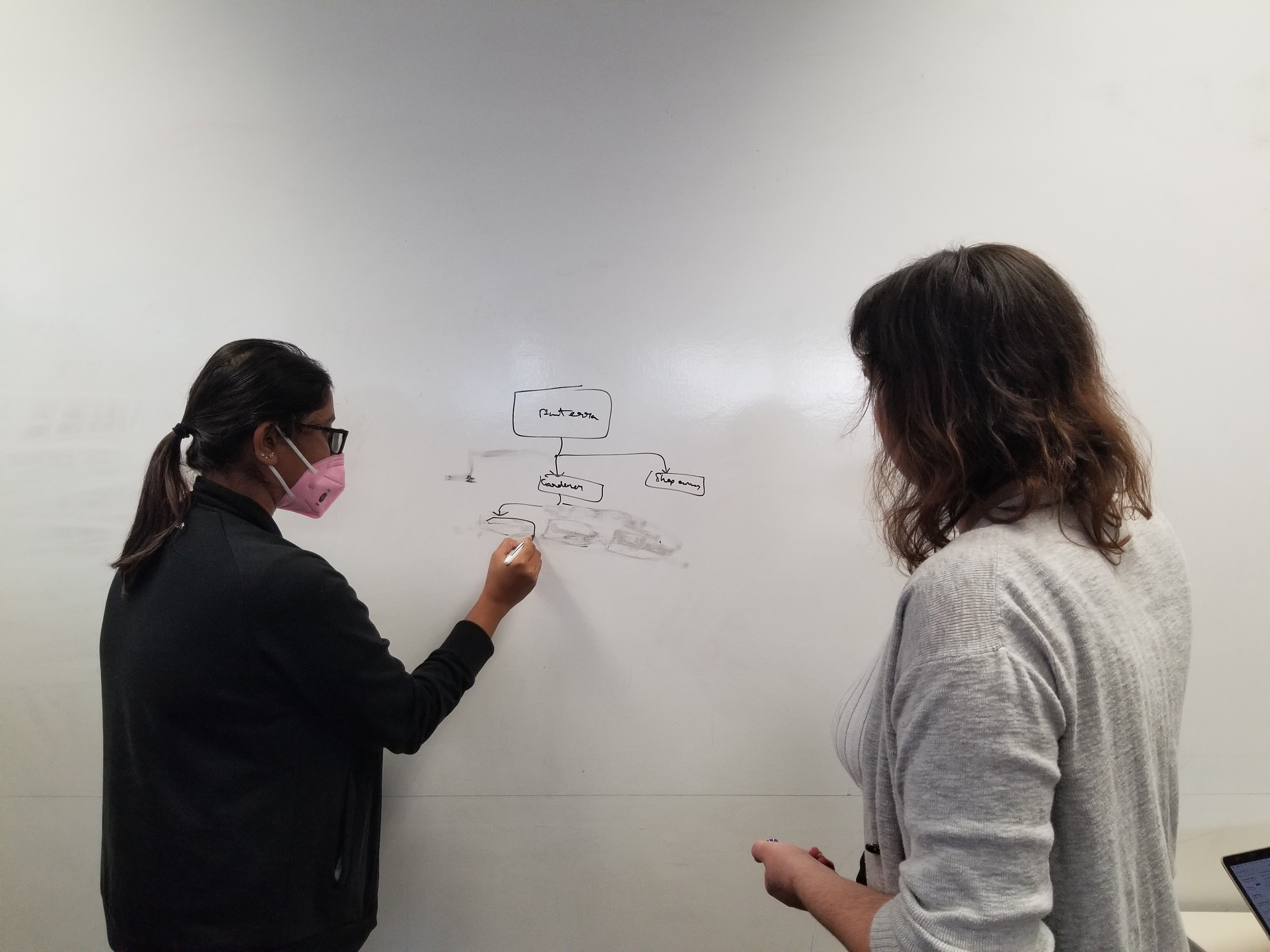
Information Architecture Blueprint ︎︎︎
User Personas
![]()
![]()
![]()
![]()
The features of the PlanTerra app will include: a virtual garden that represents their real-life plants, plant care tracking, a propagation station, a storefront, and a discussion forum where users can show off or ask questions about their garden. The following list outlines the potential capabilities in more detail:
- Virtual garden – a general view of the user’s garden and an idea of how soon a plant will need to be watered, soil condition, etc.
- Plant care tracking – a more detailed view of each individual plant’s ideal living conditions.
- Propagation station – The propagation station will give more advanced users instructions on how to begin propagating plants, such as how to take clippings, what kind of environment the clippings should be in, and how long it will take before it should be potted.
- The storefront – a virtual storefront will show users new plants, pots, or other accessories they may be interested in purchasing for their garden based off of their previous purchases or current plant ownership. Users may also open a storefront related to their own gardening endeavors.
- Discussion forum – a social space where plant parents can ask each other questions regarding plant care, show off pictures of their plants, chat with local gardeners, and grow their hobby.
Information Architecture Blueprint ︎︎︎
User Personas


︎︎︎Affinity Diagram
Each team member was responsible for interviewing one user regarding their current plant care routine and potential pain points.
While conducting our interviews, we compiled the raw data notes from all participants into a FigJam file. These notes included direct quotes and extra information about the participant’s interest in plants. The raw data notes were then analyzed and synthesized into 154 work activity notes, which were then grouped according to topic/category.
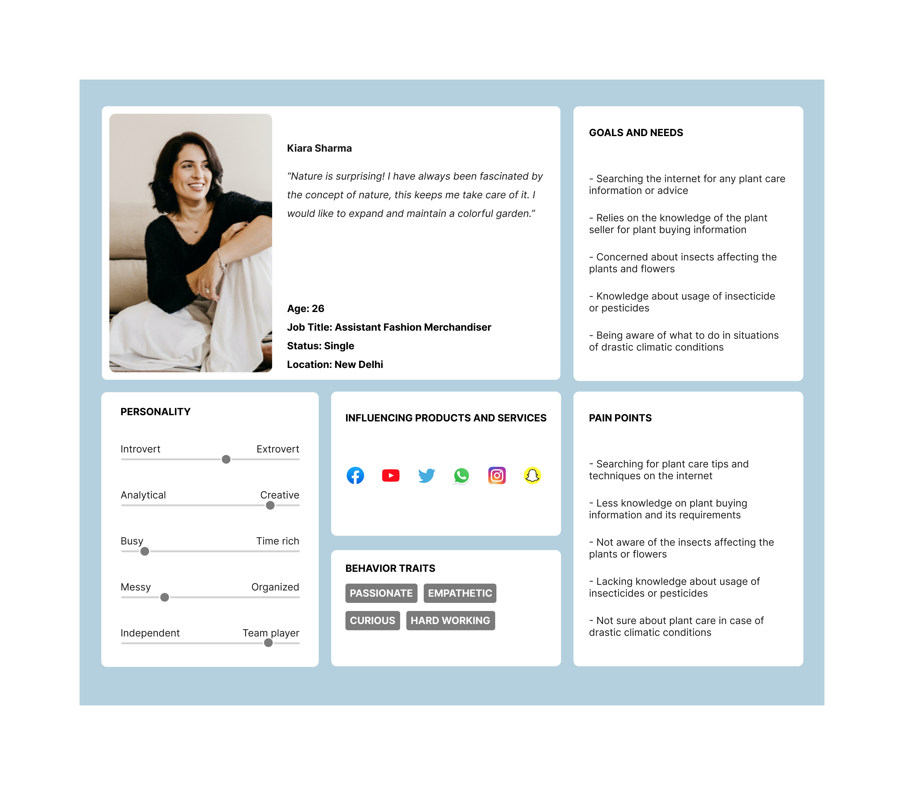
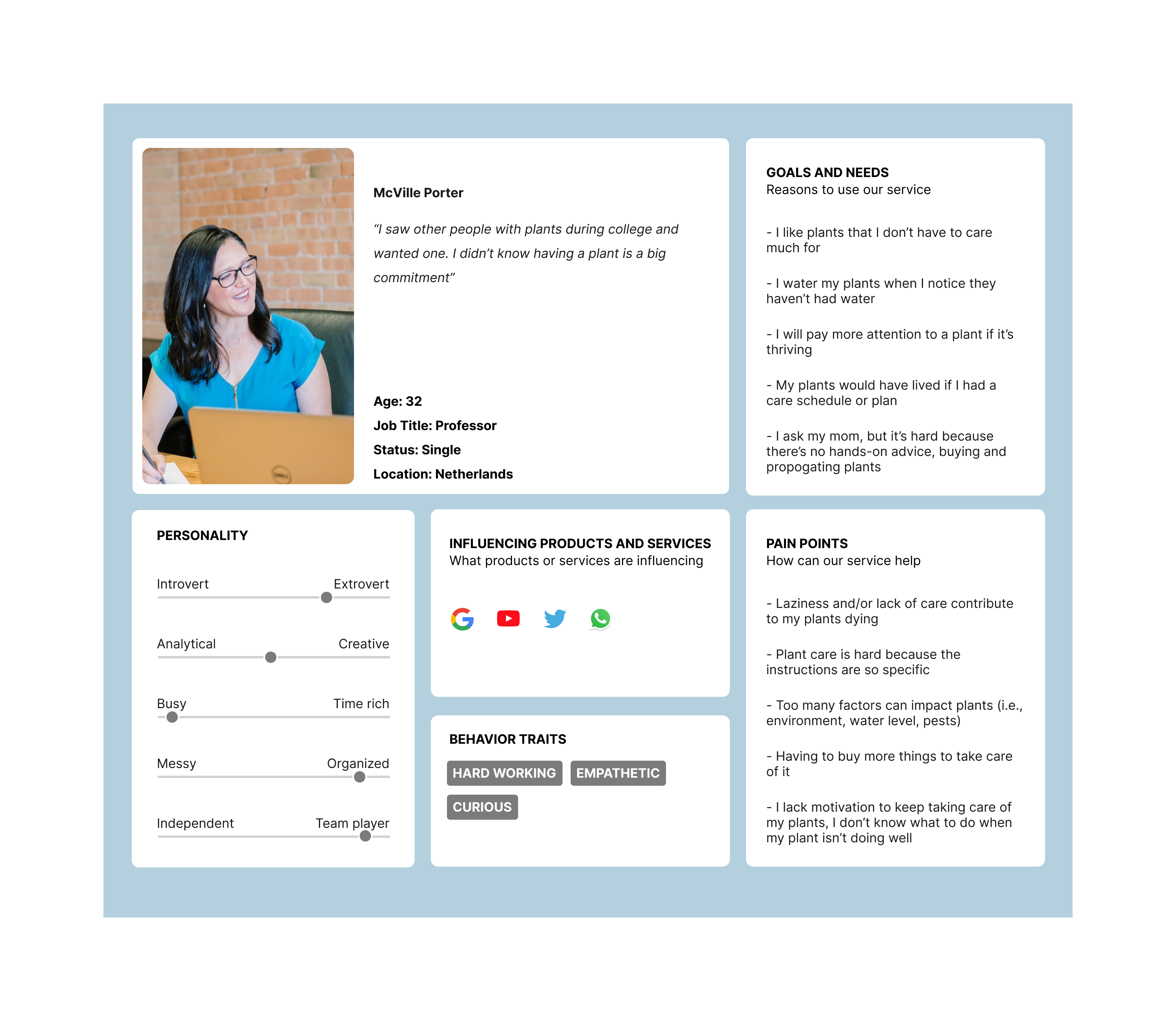
Using our interview data and user work roles, the team developed four distinct user personas. These personas considered that each user would have different goals and pain points according to their lifestyle and career.
Since we wanted to design based on a persona that represented our target audience, we chose Kiara Sharma, the inexperienced user willing to expand their garden and learn more about plant care. Choosing a beginner persona enabled us to focus on the foundational aspects of our app. Later on, the team focused on the needs of a more experienced persona to build out the more advanced features.
After developing a strong understanding of the user base and needs, we used our insights to begin designing an iterative prototype for user testing.
Lo-fi Prototyping
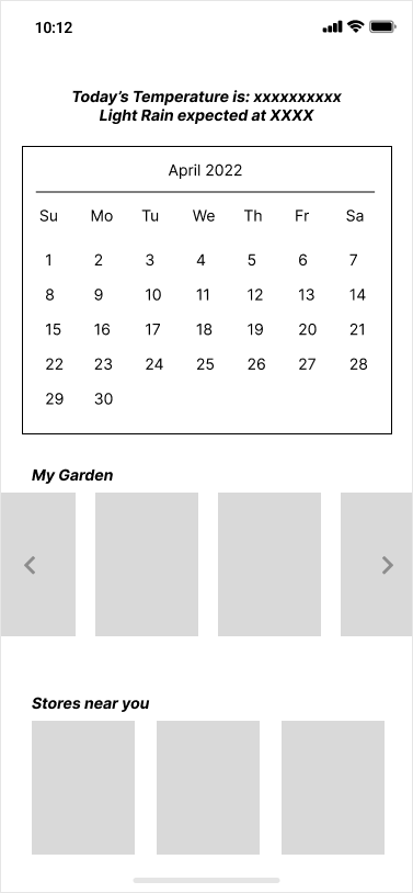
We used our survey results to determine which information about the different shops would be most important, and what type of filters the users would be interested in using and wanted to create a protoype that showcased this information.


︎︎︎initial sketches
Final Prototype + Next Steps
To build the final prototype, we focused on the completion of core tasks for each level of gardener.
For all gardeners:
1. Add a plant: users must add a plant to their garden and set up a reminder to water and
fertilize them
2. Complete daily plant care tasks: users must mark your daily plant care tasks as
complete.
3. Determine plant needs: find out what type of soil your Orchid needs.
4. Participate in the Forum: access the forum and submit a post about your plant. Make
sure to add an image of the problem.
5. Explore the storefront: access the storefront and see information about the sellers there
For competent and expert gardeners:
6. Check off propagation: see if your propagation needs to be potted, if it does, complete
the potting process.
For store owners:
7. Create a storefront: add your storefront to the app. It focuses on produce and pottery
Next Steps:
From conducting our pilot test, we learned that the ‘Add’ button was not as intuitive as we
initially hoped as it led to confusion and frustration in the participants as they went through the
app. There were also smaller items that were overlooked in the original design, such as the size
of buttons in the app and the ‘Add’ button turning into ‘Submit’ to upload information, which led
to the participants having difficulty completing key tasks within the app. In light of this, some
things that we would want to implement in future designs would be larger, labeled buttons that
are more noticeable for the users and having consistency in the app regarding the function of
the ‘Add’ button. Additionally, if we were to build out tutorial and onboarding screens in the
future, this could also aid the user in accessing the full capabilities of the app without being
confused.
We also gained helpful feedback from another team’s heuristic evaluation of our prototype. The
evaluation led us to understand that the foundation of our prototype is strong, however there is
still refinement that needs to take place in order to increase user understanding. Much of this is
tied to how the user is receiving feedback from the system– in the future, our team would like to
work on creating more clear and understandable success messages, as well as provide better
help and error messages if a user is unable to complete a task. In the future, our team would
like to spend more time redesigning the features that were troublesome for pilot test users and
the evaluation team, such as the button size and ‘Add’ button, potentially through multiple
iterations or through the use of A/B testing.