Caffinder
>Spring 2022>INF385E: Information Architecture and Design
>Role: UX Design, Research
>Team: Anita Tsai, Chia-yu Hu, John Meyer, Yen-Jen Huang
>Tools: Figma, FigJam, Usertesting.com, Qualtrics, Google Slides
Caffinder helps college students and remote workers find the best coffee shop for their workflow.
Context
As the number of remote workers in the United States rises, the demand for workspaces outside of a traditional office has increased. Coffee shops benefit greatly from this cultural shift. According to this Forbes article: with the closure of office buildings around the country, coffee shops can take advantage of the work-from-home revolution by becoming a primary workstation for thousands during the pandemic. Utilizing the already robust coffee shop culture can help remote workers be more productive and happier with their work environment, but finding the right coffee shop for them becomes a pain. Coffee shop environments are diverse in the United States. There are specific considerations when trying to find a workspace that are overlooked with existing search and review applications, making it difficult for users to find the right fit.
Solution
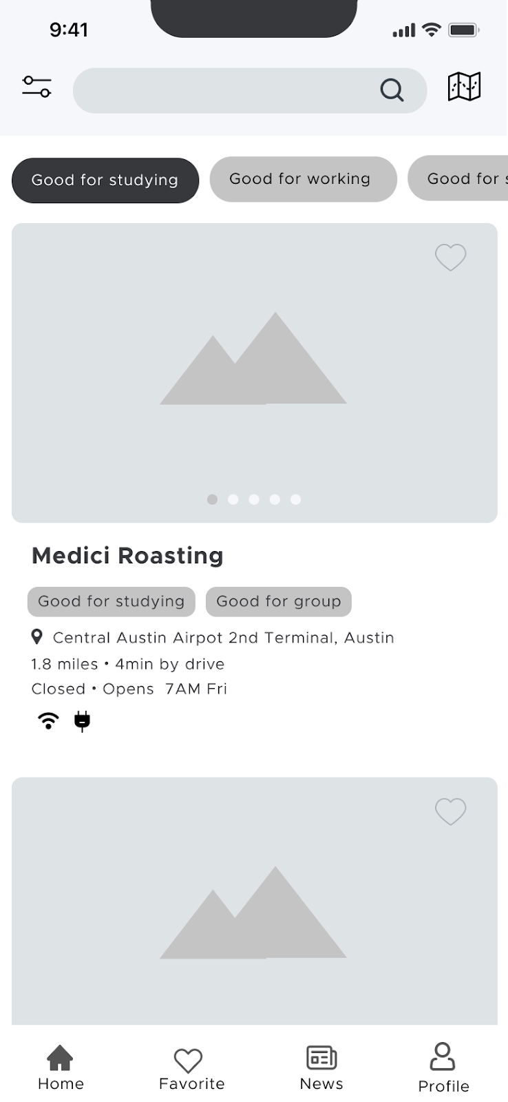
Therefore, our team set out to create an app that would aid both remote workers and students in finding their ideal coffee shop by implementing a robust filtering system that is tailored specifically to their needs.
Full project documentation can be found here.
Ideation + User Research
To start, we created an affinity map of features potential users may look for when trying to find a place to work and study.
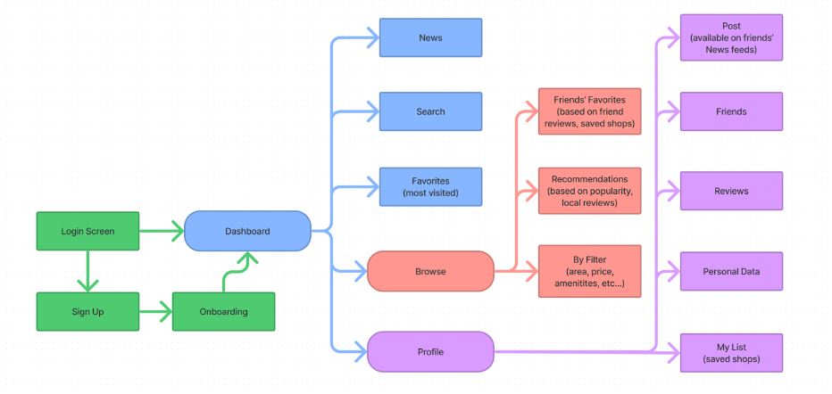
We split the functions into two major categories, with opportunities for expansion. The first category focuses on the coffee shop finding process, while the second focuses on the user profile and their ability to save, share, or wishlist different shops. Using these ideas as a foundation, we developed a basic information architecture blueprint for the application.
![]()
We split the functions into two major categories, with opportunities for expansion. The first category focuses on the coffee shop finding process, while the second focuses on the user profile and their ability to save, share, or wishlist different shops. Using these ideas as a foundation, we developed a basic information architecture blueprint for the application.

Before we moved into prototyping, the team needed to figure out which sort of filters and features potential users would like to see in our product. To figure out this information, we developed a qualtrics survey which was sent out to students and remote workers to determine which sort of features were most important. The survey also gave us a general idea of the main pain points users had with current methods for finding coffee shops.

︎︎︎one set of results from the survey
From these results, we determined that wi-fi speed and amount of sockets were two of the most important features for users when searching, while most other critera were important, but less pressing.Branding + Lo-fi Prototyping
The logo combines two recognizable images; a coffee bean and a GPS map pin. The overall profile is a coffee bean, where one half is transformed into the map pin. This metaphor captures the intent of the app to help people locate a coffee shop.
The color scheme is implemented in the high fidelity mock-ups, and borrows some language from the coffee roasting process. The use of green is similar to the “green” coffee bean, which references the raw, unroasted bean. The yellow color references a blonde roast, while the orange references the heat used in the roasting process.


We used our survey results to determine which information about the different shops would be most important, and what type of filters the users would be interested in using and wanted to create a protoype that showcased this information.
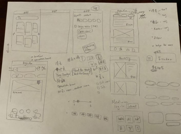
︎︎︎initial layout sketches

User Testing + Iteration
After developing a usable prototype, we completed multiple rounds of user testing, with tasks that corresponded to core app functions.
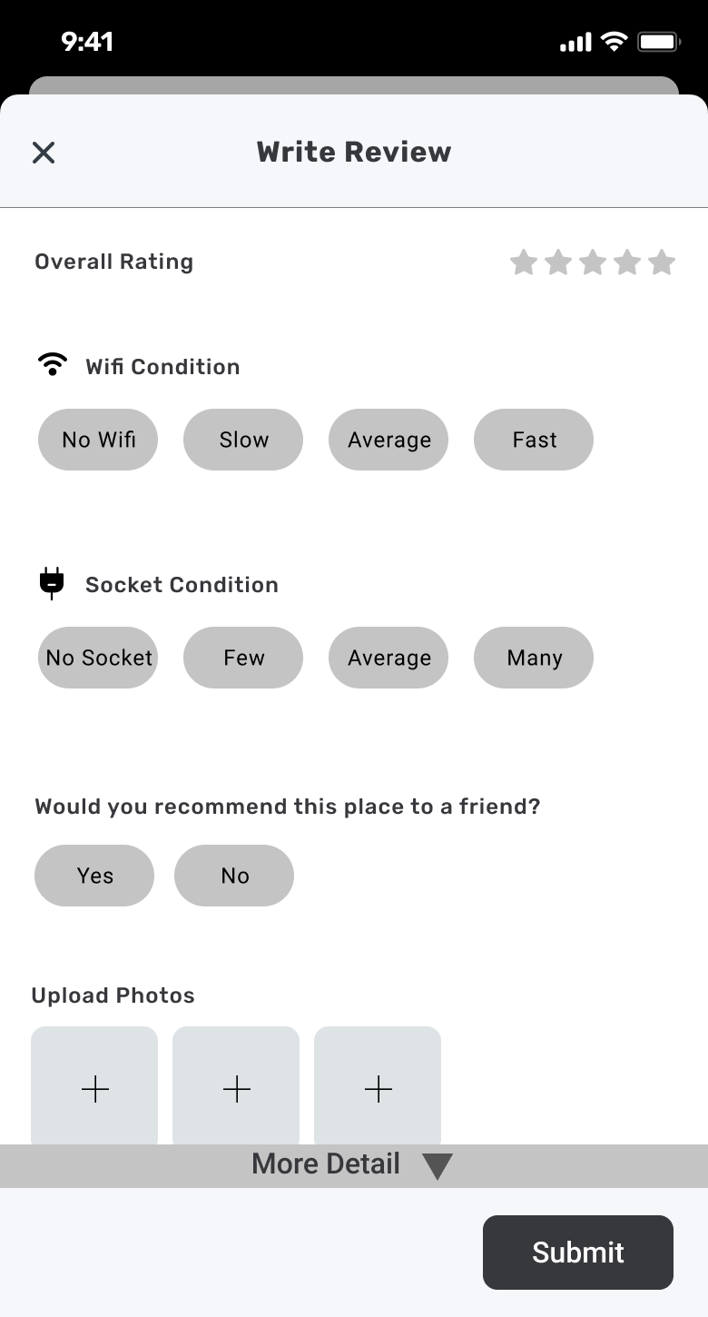
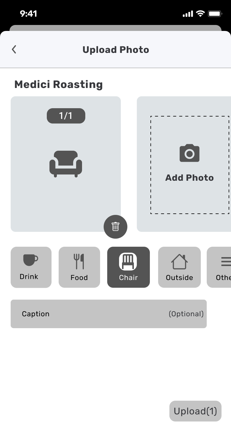
From these rounds of testing, we determined that users had issues finding the filter button when asked to narrow their search. We decided to change the icon to the funnel icon used by Excel and other programs and we’ll test the new icon in our next round of testing. Next, users had trouble distinguishing between our Check In button and the Review button, mostly because both led to the review screen. We have removed this function from the Check-In button, which now only functions to record a user’s trip to a coffee shop. Our participants also had problems finding the heart button that would allow them to follow a coffee shop. The former icon was a heart outline with a thin gray line, and it blended into the background. We’ve added a contrasting circle to make it easier to see. A few users had trouble understanding the group icon on the main navigation bar. They thought they needed to go through that menu to follow another user, while others just used the search bar. We plan to go back to using text below each menu icon to reduce confusion. A couple of users mentioned that the follow button in our sample user’s profile was too easily missed. As a result, we’ll be changing the icon to make it more obvious. Another problem was the way we were displaying amenity ratings. Participants were confused by the meaning of the numbers, especially for seat condition and lighting. They weren’t sure if a low number meant a hard seat and dim light or a comfortable seat and bright light. We’ve decided to use a color-coding system (red, yellow, green) instead of the numbers, and we’ll be testing this change. Lastly, users had trouble finding the detailed review options, so we’ll be making the “more details” button easier to find.
From these rounds of testing, we determined that users had issues finding the filter button when asked to narrow their search. We decided to change the icon to the funnel icon used by Excel and other programs and we’ll test the new icon in our next round of testing. Next, users had trouble distinguishing between our Check In button and the Review button, mostly because both led to the review screen. We have removed this function from the Check-In button, which now only functions to record a user’s trip to a coffee shop. Our participants also had problems finding the heart button that would allow them to follow a coffee shop. The former icon was a heart outline with a thin gray line, and it blended into the background. We’ve added a contrasting circle to make it easier to see. A few users had trouble understanding the group icon on the main navigation bar. They thought they needed to go through that menu to follow another user, while others just used the search bar. We plan to go back to using text below each menu icon to reduce confusion. A couple of users mentioned that the follow button in our sample user’s profile was too easily missed. As a result, we’ll be changing the icon to make it more obvious. Another problem was the way we were displaying amenity ratings. Participants were confused by the meaning of the numbers, especially for seat condition and lighting. They weren’t sure if a low number meant a hard seat and dim light or a comfortable seat and bright light. We’ve decided to use a color-coding system (red, yellow, green) instead of the numbers, and we’ll be testing this change. Lastly, users had trouble finding the detailed review options, so we’ll be making the “more details” button easier to find.
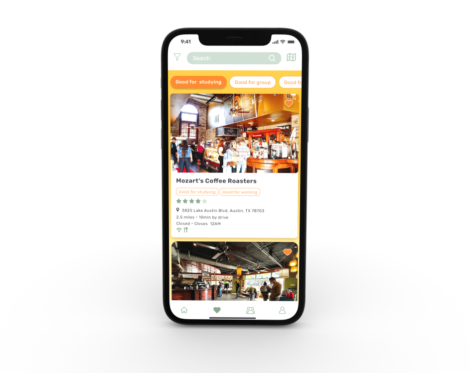
Final Prototype + Take-aways
From user testing results, we refined the prototype to make a final, high-fidelity prototype. This prototype could be expanded upon in later stages of development to create a more robust user experience.
Our last round of testing produced very positive feedback. There were no significant problems raised, and the few small points have all been fixed since. Due to this, we believe it would be aim to further refine our design with a much larger pool of test participants, or even a beta release. If we had the ability, we would like to start with a small, local release-- such as the Austin, TX market. After collecting usage information from such a test, we would try to scale up by adding other cities in the hopes of gaining enough popularity to essentially automate the scaling process. Once our app was established in these initial areas, we could create an onboarding process for coffee shops to add their information to the app.
Our last round of testing produced very positive feedback. There were no significant problems raised, and the few small points have all been fixed since. Due to this, we believe it would be aim to further refine our design with a much larger pool of test participants, or even a beta release. If we had the ability, we would like to start with a small, local release-- such as the Austin, TX market. After collecting usage information from such a test, we would try to scale up by adding other cities in the hopes of gaining enough popularity to essentially automate the scaling process. Once our app was established in these initial areas, we could create an onboarding process for coffee shops to add their information to the app.